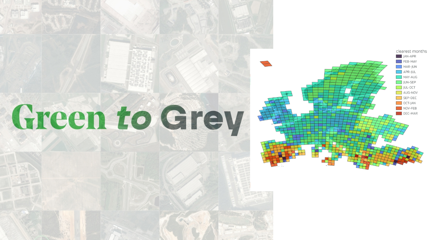
We’ve described our latest cross-border collaborative journalism project, Green to Grey, as an investigation that is the ‘first of its kind’. That’s a big claim – so, let us explain what we mean.
When we launched the project, we outlined the story of how it came about: inspired by the Norwegian broadcaster NRK’s original investigation into ‘land take’ across Norway, we came together with them and their scientific partners at NINA to approach a number of other national news teams, who gathered at our 2024 Climate Arena conference.
When we say ‘first of its kind’, we’re referring to the scale, precision, and time period studied by our Green to Grey team. There have already been estimates of ‘land take’ across Europe by the European Environment Agency (EEA), but not for the same period and not as precise (more on that later). NRK and NINA pioneered and refined our methodology in their original investigation, and we streamlined and scaled it up to develop a massive, continent-wide set of data for Green to Grey.
So, this is the first time that a land take survey of this precision and time period has been applied at the European scale. And what’s next is a step up again: our scientist partners at NINA have launched a citizen science app you can use to help verify land take around the world.
It’s called the Nature Loss Detection app. Here’s Zander Venter, one of our partner scientists at NINA, to explain:
Here’s a timeline of what we did, and how – simplified for those of us who are interested, but are not data specialists!
Step One: The Dataset
The first step to understanding the ‘lay of the land’ in this investigation was getting stuck into the raw material: images of land across Europe, and the data that showed any changes over time.
We used a dataset called ‘Dynamic World’, from Google and the World Resources Institute.The dataset classifies each 10m by 10m square of land on earth into one of nine categories:
- Water
- Trees
- Grass
- Crops
- Shrub and scrub
- Flooded vegetation
- Snow and ice
- Bare ground
- Built-up area
Every 2 to 5 days (depending on the location), the dataset updates: reclassifying each 10x10m pixel, and therefore tracking the change in the land over time.
This process is enacted using a ‘deep learning model’ – AI which is trained to process the images and do the classification. But simply counting the pixels identified by the AI is not precise enough to ensure accuracy – due to the potential for mistaken classification by the algorithm.
So, we began the refinement process.
Step Two: Poring over pixels
Raw satellite data can be noisy. Images can be obscured by cloud cover, for example. So we carefully filtered the results, making contextual decisions such as excluding months with heavy cloud coverage. This focused our dataset on periods with the most reliable imagery.
We isolated all the pixels whose “built-up” probability score rose sharply over time, and called these ‘built expansions’. In a second iteration, we also included pixels where either the “built” or “bare” score increased rapidly, marking them as potential “built+bare expansions”.
Here is what it looks like for one pixel identified as ‘built-up’ in Germany: Sentinel-2 satellite images showed a forested area that was transformed into a factory in 2020. The “built probability” score for that pixel rose steadily from 2018 to 2023, classifying it as a land take.
Overall, we applied this method to roughly 84 billion pixels across Europe, processing nearly 185,000 Dynamic World images.
Step Three: Pixels to polygons
We then merged the ‘built-up’ pixels that were adjacent to each other into polygons, creating larger, mapped areas of “land take”– areas that went from undeveloped land to construction. These polygons formed the basis for the interactive maps and datasets that media partners explored.
But we knew that, even with our refined dataset, just counting the pixels wasn’t enough. ‘Pixel counting’ is what the EEA does when it estimates the scale of land take across Europe; simply taking the result of its map at face value, without verifying and accounting for how accurate it is. When we approached them about the investigation, they confirmed that their indicators likely under-estimate the amount of land take in Europe, and were aware that their methodology “does not completely meet the requirements of statistical robustness”.
What we did instead was to manually verify more than 10,000 random points, which gave us a ‘verified sample’ of the map. By comparing the Dynamic World result with this sample, we were able to estimate the accuracy of our map, and the number of false positives/negatives (i.e. pixels that the AI has categorised incorrectly).
Based on this estimate, we then corrected the area of land takes identified by the map: 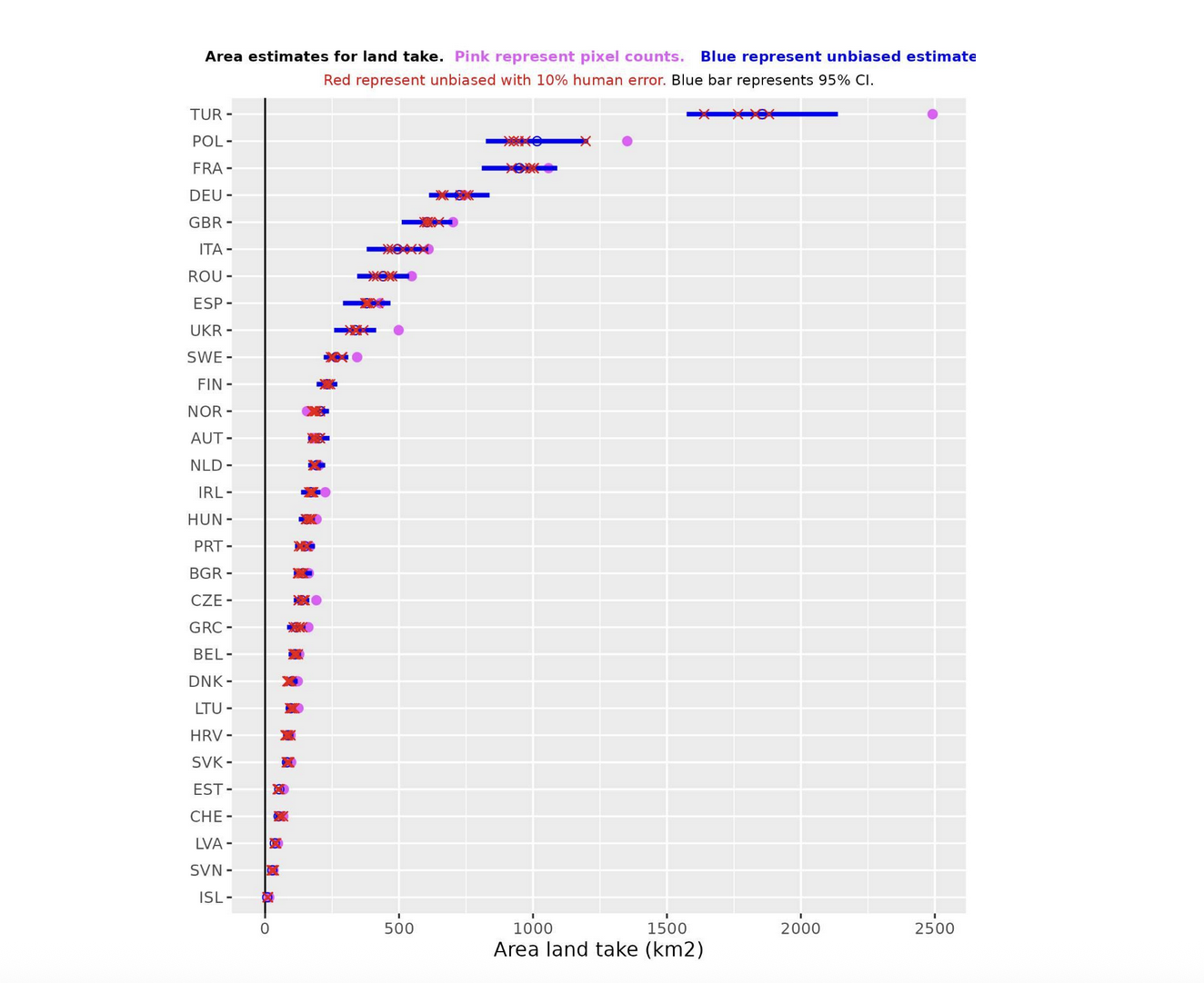
- Purple points show the raw sum of areas identified as built-up by the model.
- Blue points represent corrected figures, adjusted based on map accuracy.
- Blue lines around each point indicate confidence intervals, showing the likely range of true values.
- Red crosses display results from a sensitivity analysis, where we introduced a 10% human error rate in verification to see how much results might shift due to human error.
Our ‘sensitivity analysis’ went like this: we randomly changed 10% of the verified samples to read incorrectly, to see how ‘sensitive’ the result is to human error during verification. This allowed us to measure the extent to which a 10% human error rate during verification would impact our results.
For reporting purposes, we relied on the corrected figures (blue points). More information on how we developed the confidence intervals and sensitivity checks are detailed in our methodology page.
Step Four: Real-world impact
And there was a final step to this process: the living, existential context. What are the impacts of the individual land takes, as well as the land take as a whole across Europe? What should we acknowledge about the very real ways, whether specific or ambiguous, these changes will be entangled with life on the planet?
There is a human, and a biodiversity context that a map or a dataset can’t provide. Perhaps losing one 10m² doesn’t seem a problem; but what if that ‘pixel’ is protected by conservation laws? What if it is sacred to an indigenous population? What about the cumulative effect of thousands of single pixel changes over a decade?
Our final step was to overlap the polygons of built-up areas with datasets on valuable natural areas. This step helped us identify striking case studies, and human stories – instances where construction directly impacted ecologically important landscapes. These findings not only enriched the data but also guided on-the-ground reporting by media partners.
By combining cutting-edge AI datasets, manual verification, and cross-referencing with environmental data, we built a more accurate picture of land take across Europe. The results highlight both the scale of urban expansion and its impact on natural areas, offering a foundation for further reporting and policy discussions.
The next stage of this project is to scale-up globally using NINA’s citizen science app, as noted in the introduction. You can contribute to this work, helping us map nature loss around the world, here.